Client: EA Sports
Date: May 19, 2015
Categories: Electronic Arts / JS
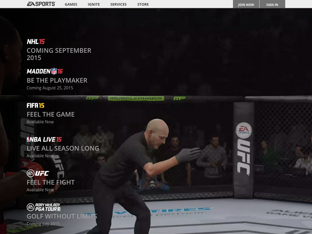
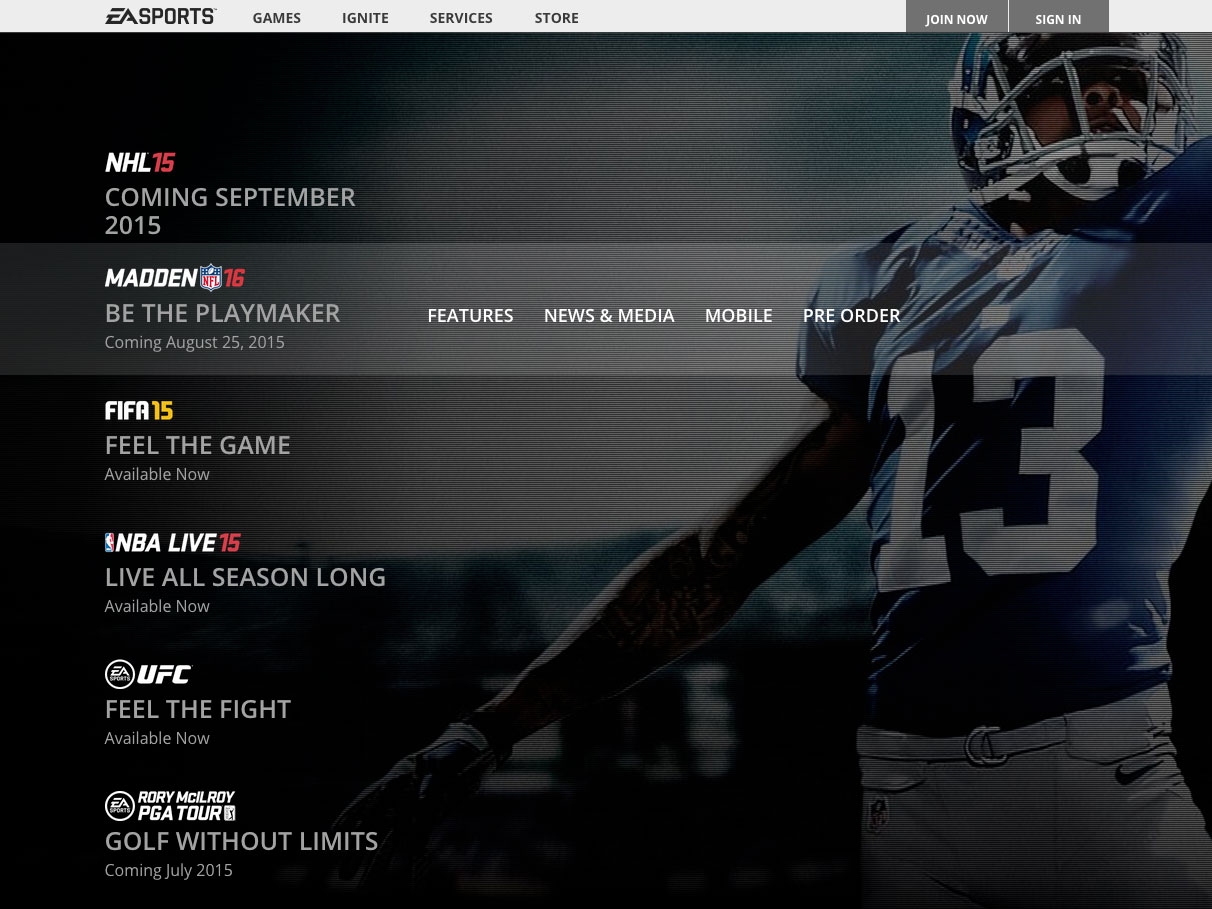
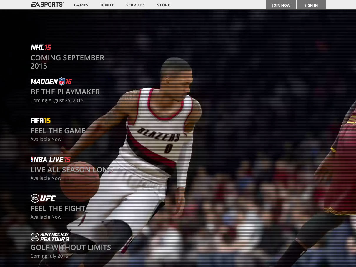
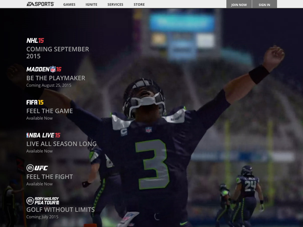
For this project I was given the art and UX and needed to take that and create the visual representation on the page that would be used for the homepage of easports.com. This primarily used html5 video for the background element and then javascript to handle the overlays. Before moving into some of the more complex conditions I had the first version working with javascript only being used to run the background video, everything else was carefully crafted css selectors and pseudo selectors.
The mobile experience for this was different of course due to the limitation against having background videos on a mobile device. For that we used the background image seen on the desktop view and added a Ken Burns effect to give it some life. This is also one of the few page templates on the site that includes a specific layout for tablet devices.
The goals for this redesign of the homepage were to get the user into their target game quickly so they could get to the meat of what they really were there to do and not linger on the homepage where there used to be postings from all games in a mosaic type layout. Overall the goals set for this redesign were all met. Since launching this page the video and content has already started to evolve which was planned. As new games launch or have new major announcements, like announcing the cover athlete for Rory McIlroy PGA TOUR, that game could get shifted to the top for more prominence before moving back to where it would belong in the normal stacking order.



Comments are closed.